Graduate Project / Human Factors & Usability Metrics Course
Usability Testing on eBay’s Core Features
Overview
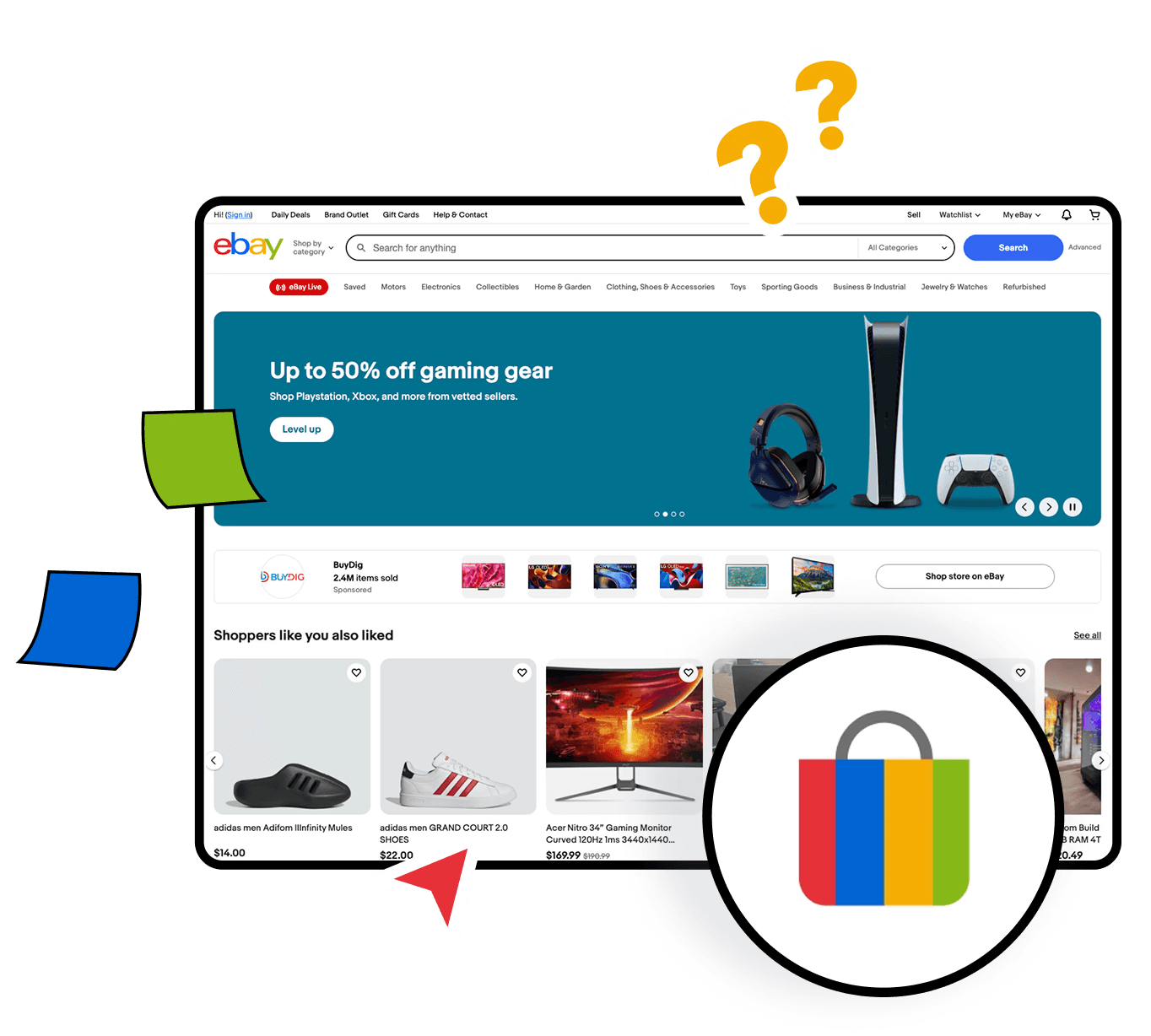
eBay is a popular global e-commerce platform where millions of people buy and sell everything from everyday items to unique collectibles. This usability study aimed to evaluate the user experience on eBay by focusing on three core tasks: listing an item for sale, searching with filters, and purchasing a product. The project was completed as part of the Human Factors & Usability Metrics course during my master’s program.
My Role
I conducted usability tests, identified pain points, and proposed heuristic-based design improvements with two teammates.
Timeline
May 2025 - 3 weeks
Tools
Zoom
Google Docs
Pen & Paper
Setting the Stage
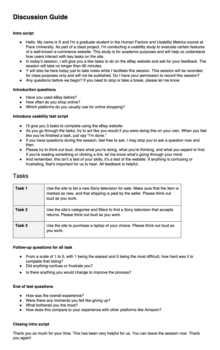
Before jumping into usability testing, we needed a solid foundation. Together as a team, we took time to define our research goals clearly and translate them into focused questions. To ensure a smooth experience for participants, we crafted a detailed discussion guide that covered everything—from welcoming scripts and warm-up questions to task instructions and closing prompts.
I played an active role in shaping the structure of these sessions and coordinated our pilot test. Running this trial round gave us valuable insights into session flow, task clarity, and time management before testing with real users.
Reaching the Right People
To uncover a wide range of usability insights, we recruited 6 participants with varying levels of experience using eBay’s platform. By including both novice and experienced users, we were able to observe how familiarity influenced navigation and task success. This also helped us identify which parts of the experience rely on prior knowledge and where new users tend to struggle.
In the Field: Test Execution
Sessions were conducted both in person and remotely via Zoom, depending on participant availability. Each session involved one facilitator and one note-taker. I actively took part in facilitating and note-taking, ensuring I followed the discussion guide and encouraged participants to think aloud throughout the tasks.
To support our analysis, I helped manage session recordings and transcriptions. I also took the lead in organizing our real-time notes and later refined them using the session recordings to ensure we didn’t miss any critical insights.
Turning Feedback Into Insight
After testing, we merged our notes into a shared document and reviewed session recordings to uncover additional insights. We analyzed each session individually to identify usability issues and grouped recurring problems across participants. Each issue was evaluated based on its frequency, impact on task completion, and the level of user frustration observed. Based on these factors, we assigned severity ratings (low, medium, high).
This structured analysis helped us prioritize the most critical issues and informed our design improvement suggestions.
Task 1: Listing a new Sony TV where seller pays for shipping
Visibility of System Status
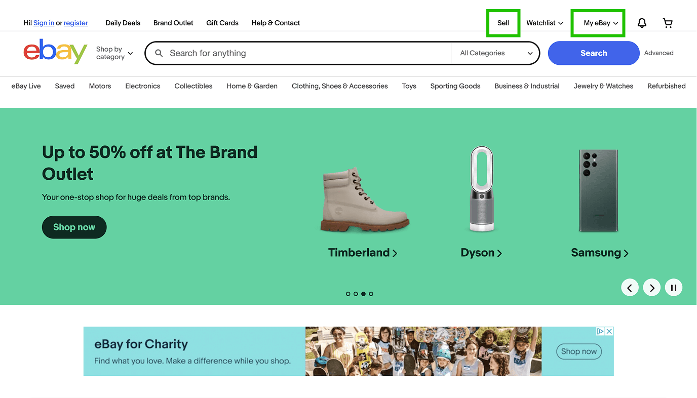
All participants successfully completed the listing. 4 out of 6 participants immediately went to the “My eBay” or “Sell” button, with 2 remaining participants selecting those options eventually during the task.
Consistency and Standards
5 out of 6 participants successfully indicated it as “New” and selected “Seller Pays” for shipping because of how it was grouped with simple language and elements.
User Control and Freedom
Participants were able to select different routes in order to start the same listing the process.
ebay.com
Visibility of System Status (Effectively Invisible Element)
Some participants did not see the “Sell” or “My eBay” button, delaying the process and confusing them.
Severity: 🔴 High
Aesthetic and Minimalist Design (Poor Grouping, Unattractive Appearance)
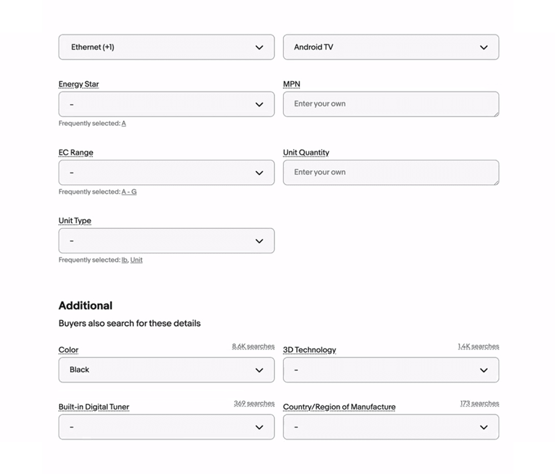
Multiple participants felt the process was too long or had too much confusing information that needed to be filled out.
Severity: 🟠 Medium
Match Between the System and the Real World (Uncomprehended Element)
Multiple participants had trouble with the wording, such as Participant 1 with “MPN,” when filling out the tech requirements for the television.
Severity: 🟠 Medium
Required Listing Fields
Recommendations
Task 2: Finding a Returnable Item (Searching for a Sony TV with Returns)
User Control and Freedom
Users could easily apply filters and refine their search, indicating they had control over the interaction and flexibility to adjust their results.
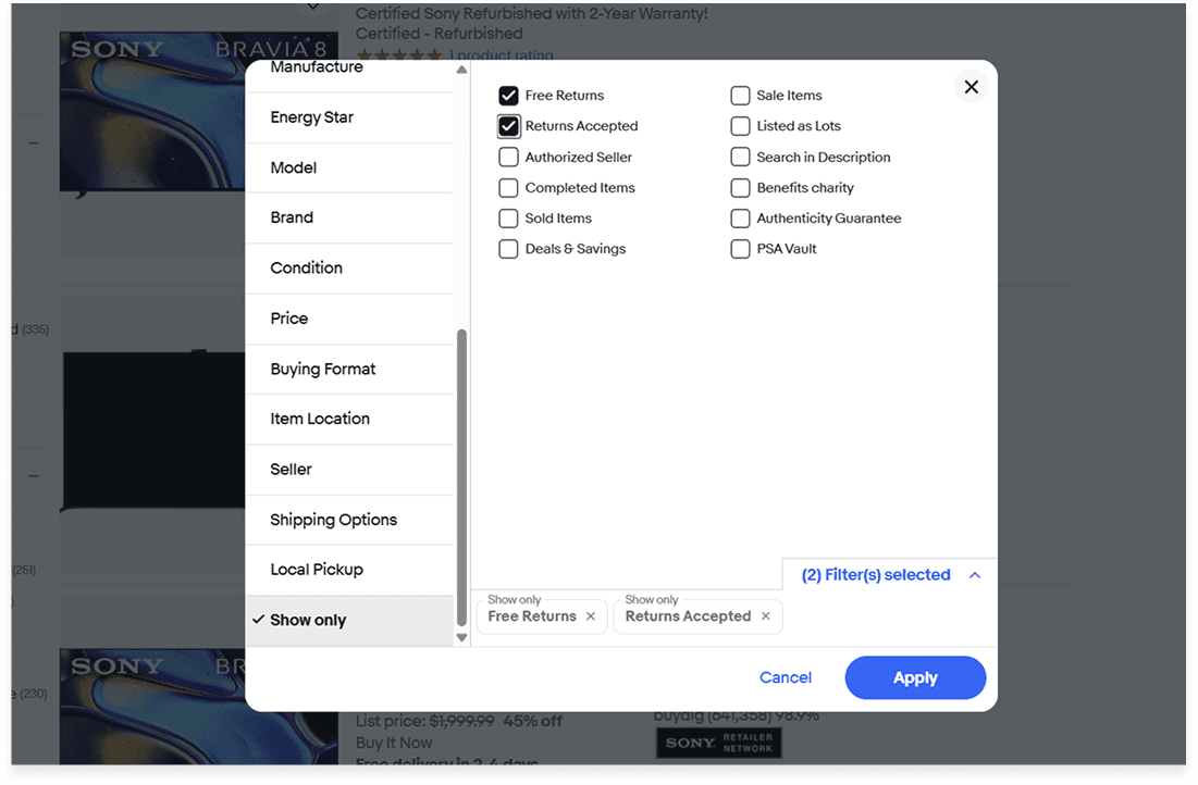
Visibility of system status (Distraction)
Some participants had difficulty finding the “Return accepted” filter due to its placement deep within a long list. The option wasn’t immediately visible, requiring extra effort and scrolling.
Severity: 🟠 Medium
Aesthetic and Minimalist Design (Information Overload, Poor Grouping)
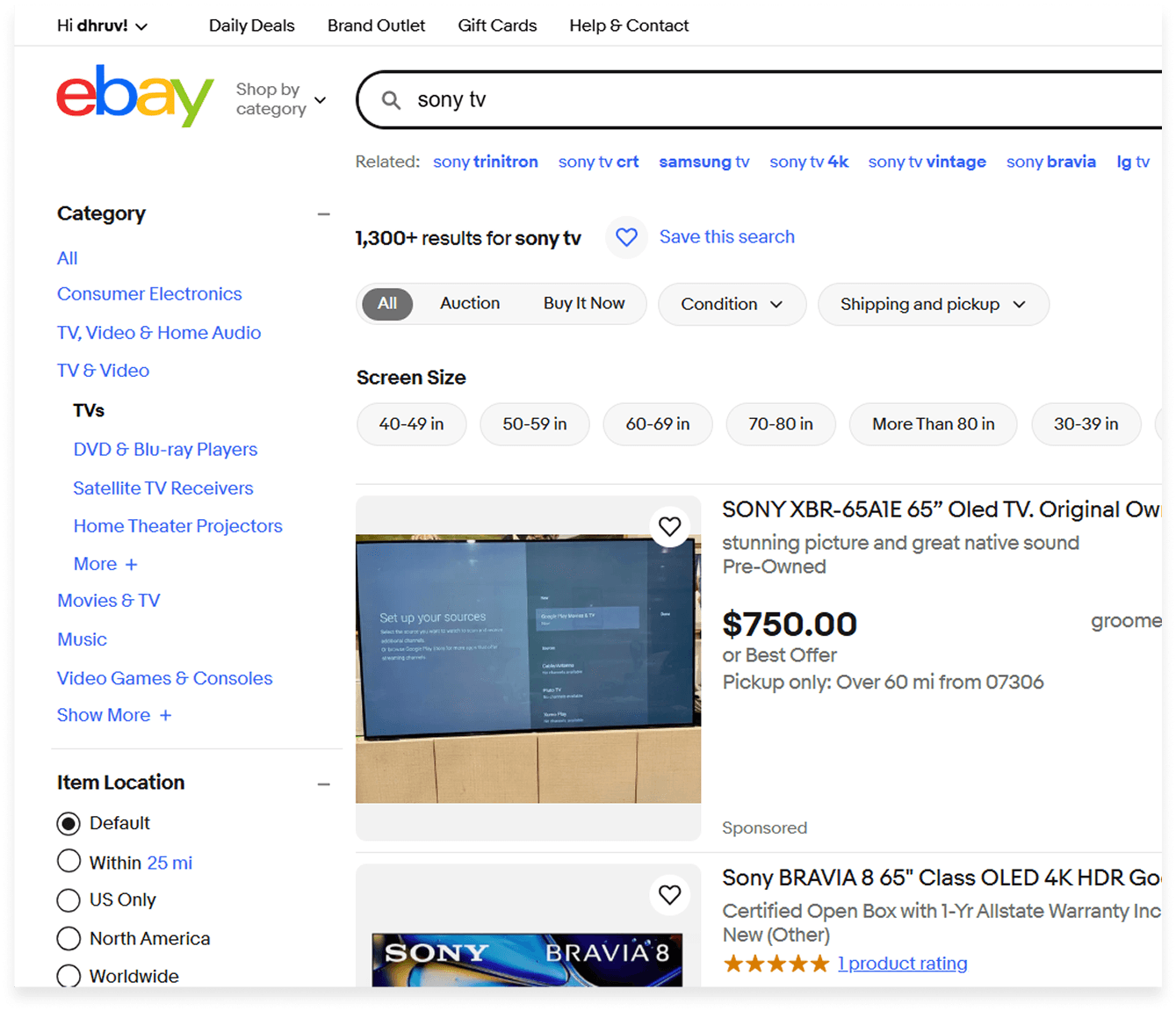
The screen layout was cluttered, with too much information presented at once. Poor grouping on product cards made it difficult to quickly extract key details, causing cognitive overload and a less efficient browsing experience.
Severity: 🔴 High
Consistency and Standards
Filter options were inconsistently placed—some in the sidebar, others on top of product cards—leading to confusion about where to look for specific filters.
Severity: 🟠 Medium
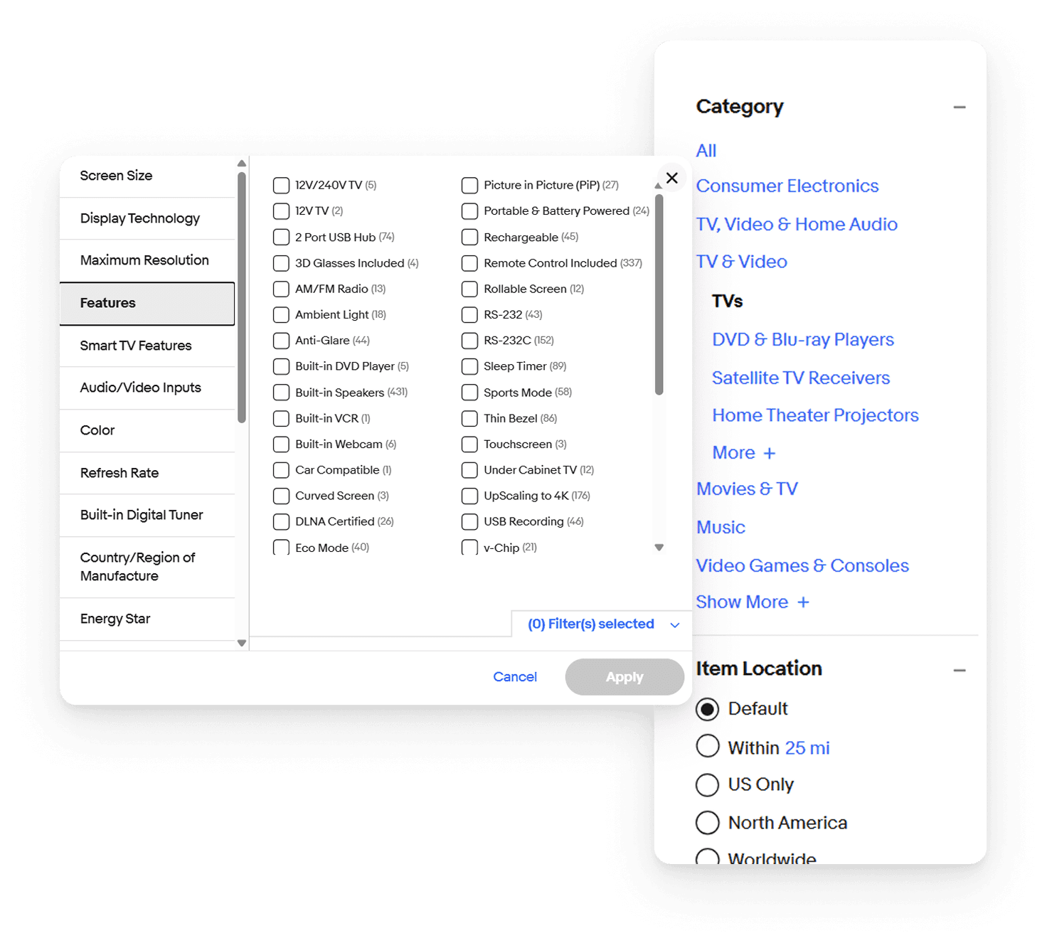
Recommendations
Task 3: Purchasing a Laptop
Match Between System and the Real World
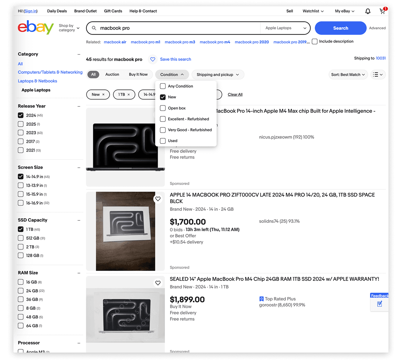
Users found the filtering process intuitive and aligned with their expectations, especially when selecting technical specifications like RAM, processor, or brand.
Flexibility and Efficiency of Use
The dropdown menus and filter options supported quick and efficient searches, making the process smoother for users familiar with what they wanted.
User Control and Freedom
5 out of 6 participants were able to navigate the site with confidence, apply filters, and proceed through the purchase flow without confusion or error, demonstrating a strong sense of control throughout the experience.
Visibility of system status (Distraction)
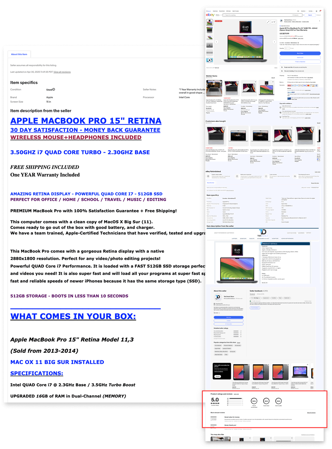
Some participants had difficulty locating key interface elements, such as product reviews and filter options. For example, 2 out of 6 users struggled to find product reviews, and a less tech-savvy user showed signs of confusion due to limited guidance. Additionally, a user spent over 20 seconds searching for the filter button, suggesting a lack of clear visibility for critical interactive elements.
Severity: 🟠 Medium
Aesthetic and minimalist design (Information overload, Unattractive Appearance)
The visual design of product descriptions was found to be cluttered and inconsistent, making it harder for users to scan and interpret information easily.
Severity: 🔴 High
Consistency and Standards
Inconsistent placement of filters and product elements caused confusion, especially when compared to more standardized platforms like Amazon.
Severity: 🟠 Medium
Recommendations
Top 3 Recommendations

Visibility of System Status
Enlarge navigation bar elements.
Make reviews more visible.
Increase filter visibility.

Match Between the System and the Real World
Clarify category names.
Group elements more clearly.
Add tooltips for confusing language.

Aesthetic and Minimalist Design
Simplify product descriptions.
Highlight key information (price, rating..).
Remove visual clutter.
What I Took Away
Running the usability sessions taught me how important it is to stay neutral and avoid leading users—even when they get stuck. It was a challenge at times, but I learned how to step back, observe, and let users navigate the experience on their own.
I also ran into a few unexpected situations, like participants giving very short answers. These moments helped me stay flexible and find ways to keep the sessions valuable and on track.
What stood out most was how much deeper my understanding of the user became. Beyond spotting usability issues, I started to see testing as a way to build empathy and see the product through someone else’s eyes.
Throughout the project, I enjoyed taking part in all stages of the UX process—from planning the test scenarios to synthesizing results and delivering our final presentation. Collaborating within a diverse team allowed me to see different approaches to problem-solving and strengthened my communication and facilitation skills.
Presenting our findings was particularly valuable, as it helped me gain confidence in articulating design decisions and defending research outcomes. This experience also reminded me how impactful user feedback can be in driving product improvements, and how important it is to maintain empathy and clarity throughout the design process.
Thank you for exploring this project! I aimed to highlight a thoughtful, user-centered research approach throughout the process :)