Graduate Project / Human Factors & Usability Metrics Course
Evaluating the Costco App: Heuristic Analysis & Cognitive Walkthrough
Overview
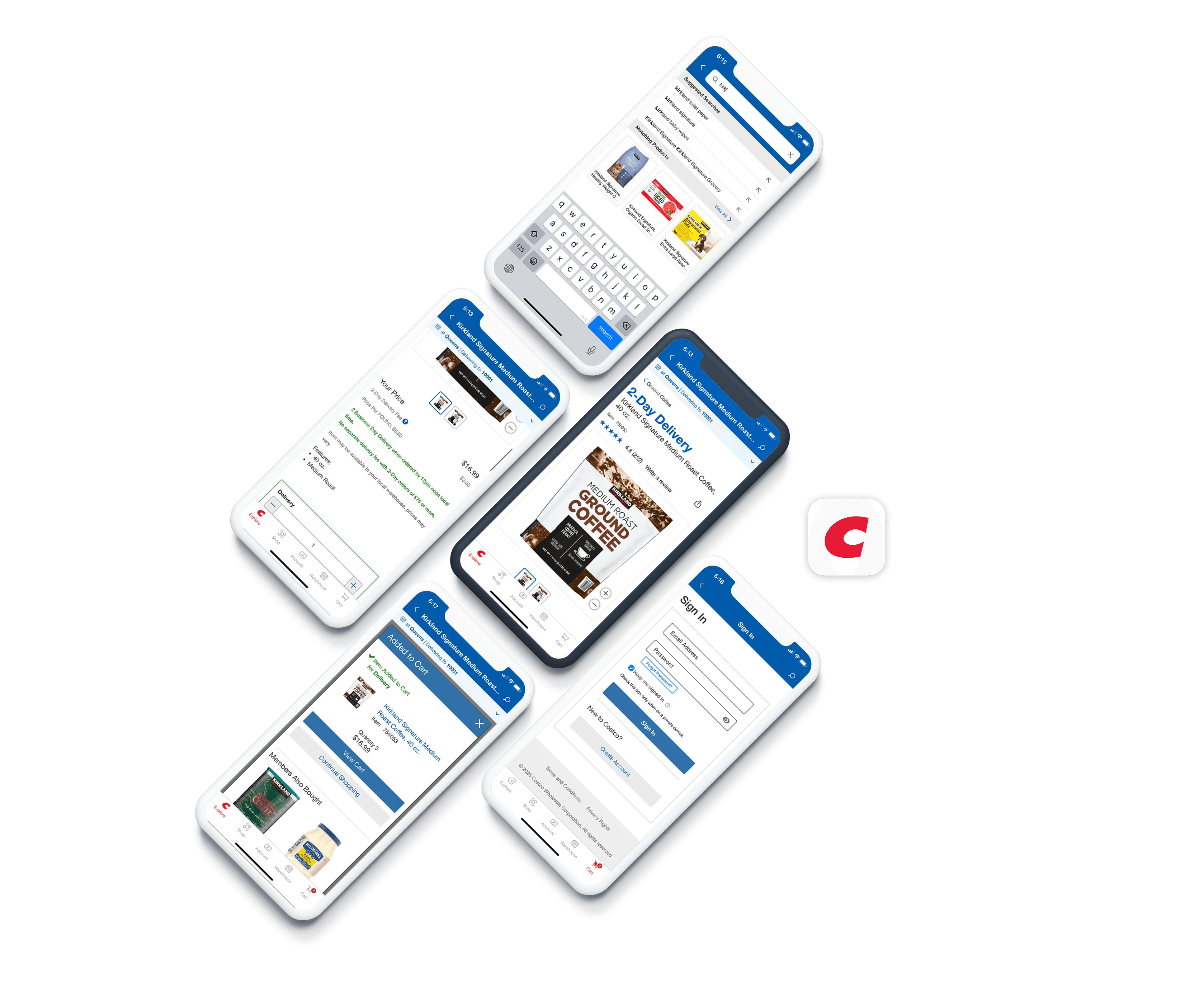
Costco is a membership-based retailer where users can browse and shop bulk products via its mobile app, with options for delivery or in-store pickup. As part of the Human Factors & Usability Metrics course during my master’s program, this project aimed to evaluate the user experience of the Costco mobile application using two key usability inspection methods: heuristic evaluation and cognitive walkthrough. Even though we worked as a team on three different tasks to spot usability issues, understand how easy the app is to use, and come up with design improvements, in this portfolio I’m focusing on just one of them: “Searching for a product and adding it to the cart as a first-time user.
My Role
I conducted heuristic evaluations and cognitive walkthroughs, synthesized usability patterns, and collaborated with two teammates to prioritize key improvements.
Timeline
Apr 2025 - 3 weeks
Tools
Google Docs
Pen & Paper
Uncovering Friction in Everyday Interactions
Mobile apps are expected to be fast, intuitive, and seamlessly support daily tasks—but when expectations aren’t met, even small usability issues can cause real frustration.
In this project, we critically evaluated the Costco mobile app to uncover hidden friction points that may disrupt the user journey. Working as a team of three UX designers, we went beyond surface-level aesthetics to explore how users truly experience the app. I specifically focused on evaluating the search and cart experience, and led the severity rating discussion during synthesis.
We used Heuristic Evaluation to assess the app against established usability principles, and Cognitive Walkthrough to simulate realistic user goals and identify breakdowns in task flows. These complementary methods helped us pinpoint both obvious and subtle issues, guiding actionable design recommendations for a smoother user experience.
Understanding the User Journey
Our first step was to identify the actions users most frequently perform in the app. Based on this, we defined three core tasks:
Searching for and adding an item to the cart as a first-time user
Purchasing an item for warehouse pickup
Reordering a previously purchased item
Each of us independently tested these tasks within the app. We took notes not only on what didn’t work well, but also on what worked effectively—because analyzing good design is just as important as spotting usability issues.
Heuristic Evaluation: Identifying the Problems
As we reviewed each task step by step, one guiding question stayed in our minds:
“How would a user try to complete this action?”
Using Nielsen’s 10 Heuristic Principles as a guide, we identified usability issues and clearly documented which principles were being violated. But this wasn’t just a list of problems—we discussed why each issue mattered and how it could be improved.
After compiling our initial observations, we came together as a team to compare notes. In some areas, we aligned easily; in others, different perspectives led to richer insights.
We then:
Ranked the issues by severity rating, and
Developed recommendations for improvement based on our findings.
Cognitive Walkthrough: Stepping Into the User’s Mind
Following the heuristic evaluation, we shifted our focus.
This time, the goal was to mentally walk through each task from the perspective of a first-time user.
For every step, we asked four key questions:
Will users try to achieve the right result?
Will users notice that the correct action is available?
Will users associate the correct action with the result they’re trying to achieve?
After the action is performed, will users see that progress is being made toward their goal?
This method helped us evaluate how intuitive the interface really was—especially for new users. It showed us once again how small design details can have a big impact on the overall experience.
Task 1: Search for a Product and Add It to the Cart as a First-Time User
While evaluating each screen in this task, I identified both strengths and usability issues based on Nielsen’s heuristics. In several cases, a single UI element impacted multiple principles. Below is a breakdown of heuristics applied and violated throughout this user flow.
Heuristic Applied
Visibility of system status
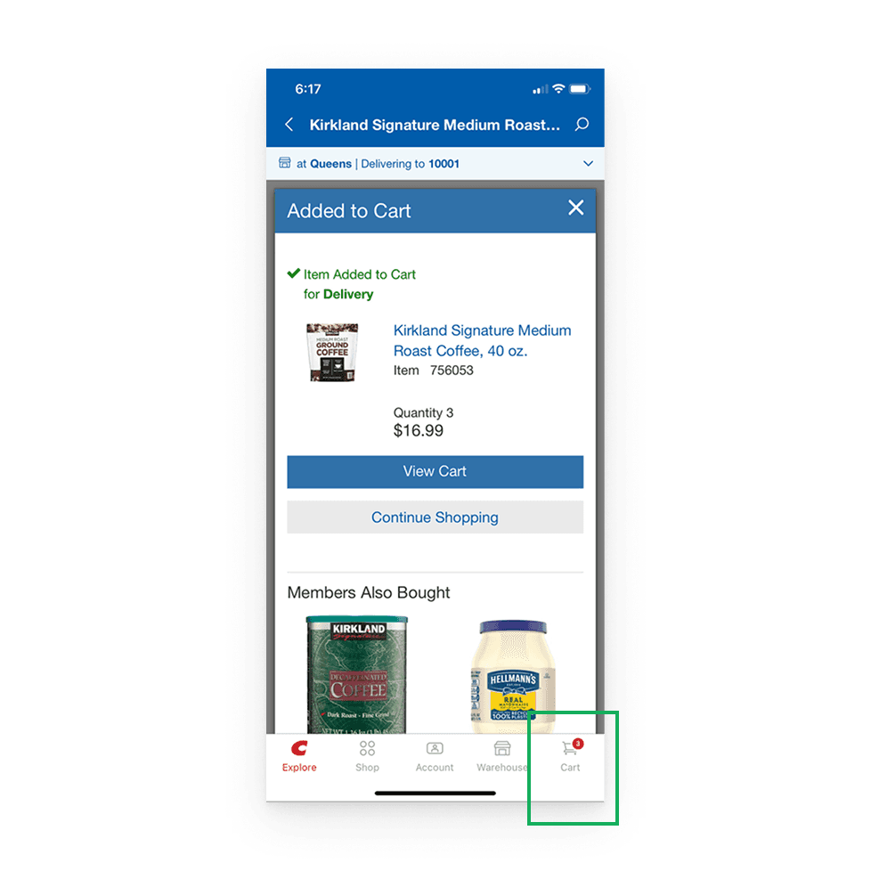
Cart view: The cart icon displaying the item count is a positive feature. The users can instantly see how many products are in their cart, which clearly shows the status of the system.
Recognition Rather Than Recall
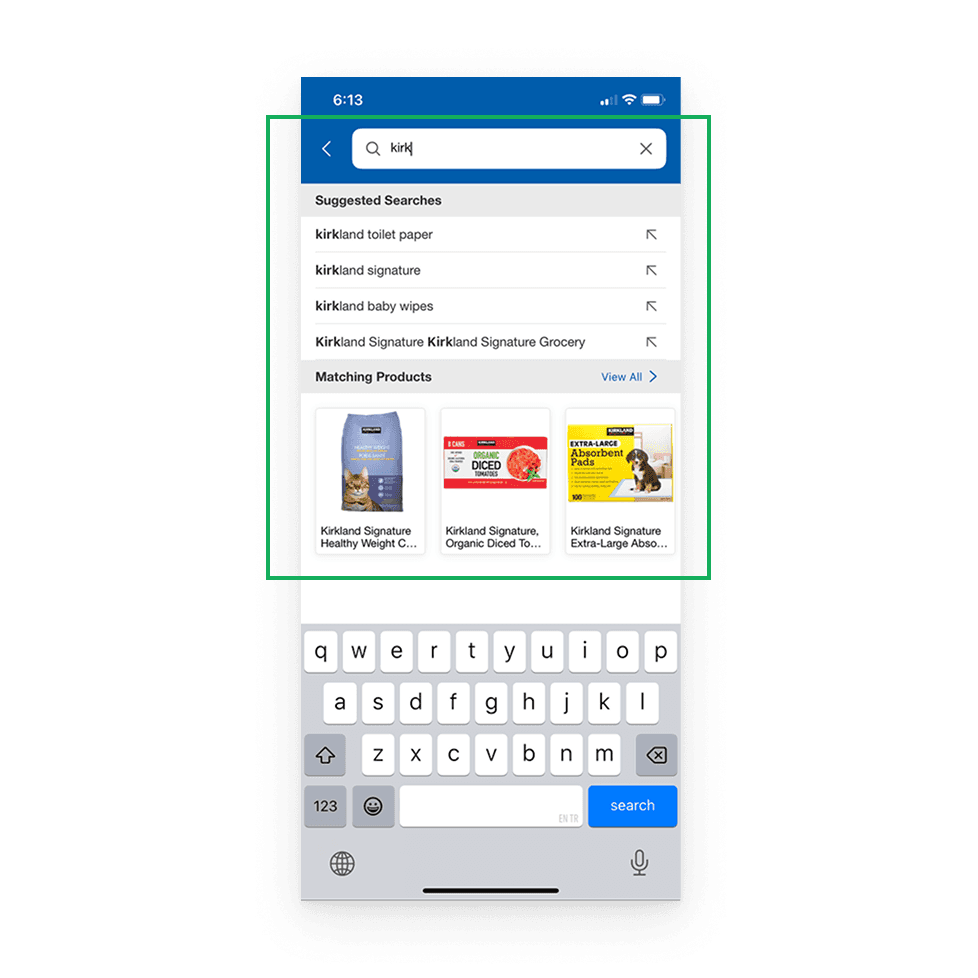
Search bar displays previous search query. The user does not have to remember what they searched for because the search term is still visible in the search bar. Displaying this information by the system reduces the user's memory load and does not require the user to make extra effort to remember their previous searches.
Heuristic Violations
Visibility of system status
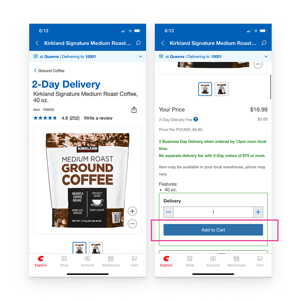
On the product detail page: 'Add to cart' is not immediately visible; it's further down. It's located after the delivery section. This delays user action and may create confusion. Placing it higher would improve clarity and support quicker decisions.
Severity: 🔴 High
Visibility of system status
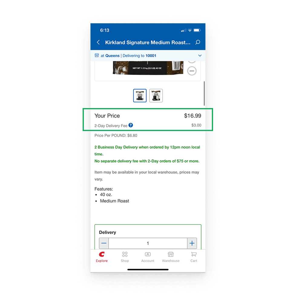
Price visibility: The price is not highlighted sufficiently. The meaning of 'Your Price' is unclear (pre-fee, post-fee, or final price?).
Severity: 🔴 High
Match Between System and Real World
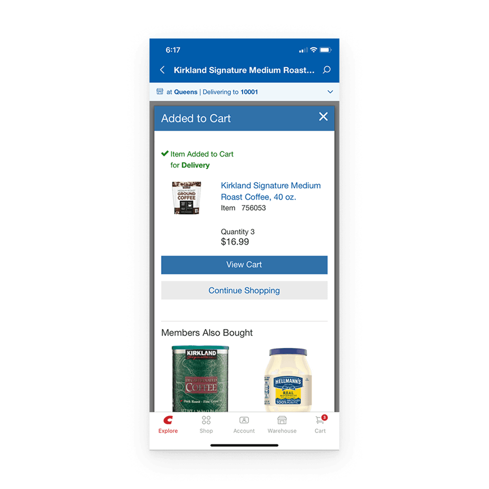
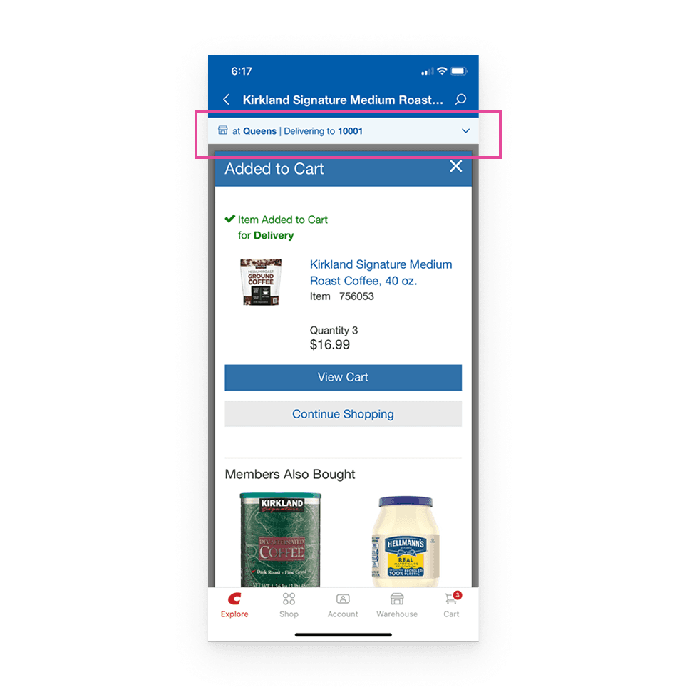
The 'added to cart' dialog allows updating location information, which seems unnecessary and highlighted inappropriately. Users do not associate the ‘added to cart’ action with the location update. The user’s mental model does not match the operation of the system.
Severity: 🟠 Medium
User Control and Freedom
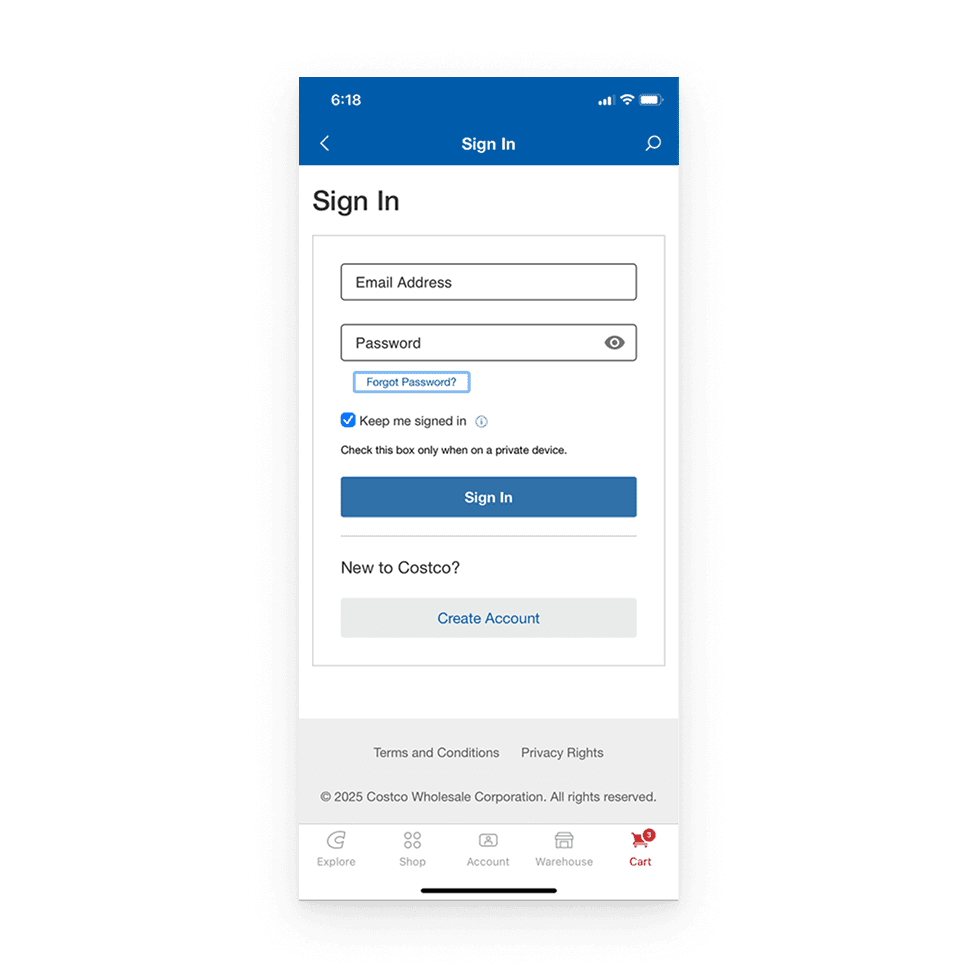
Checkout process: The checkout process strongly push for sign-in. Users are forced to log in as a guest without the option to shop. This restricts users' freedom.
Severity: 🔴 High
Consistency and Standards
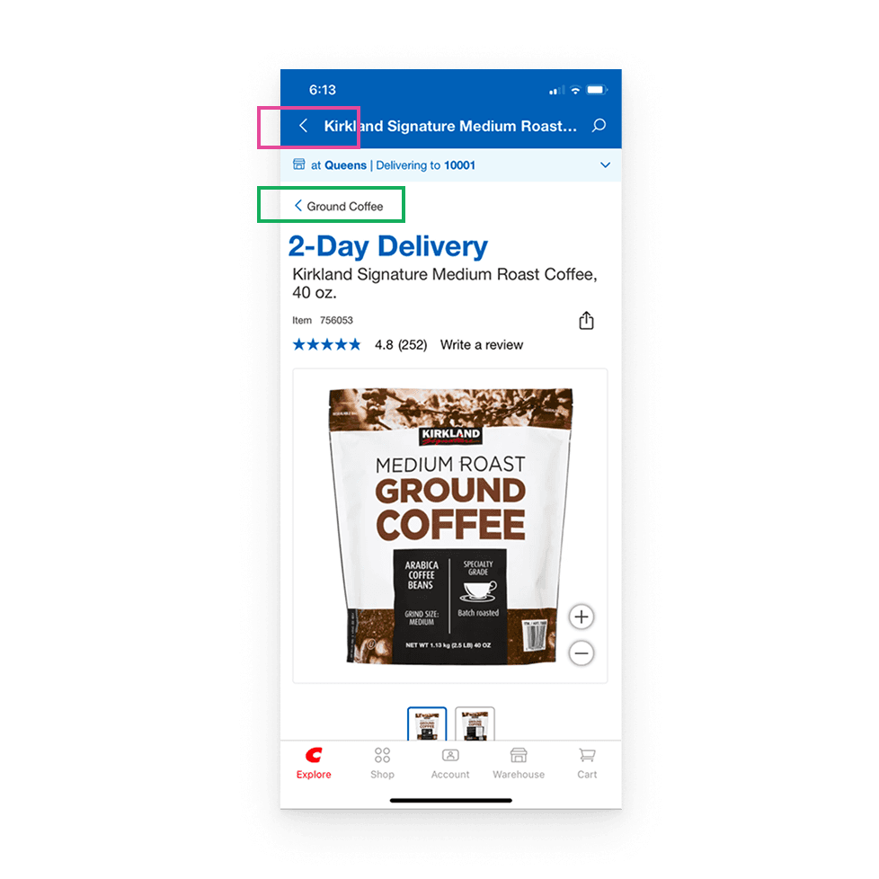
Navigation: There are two separate back options. One goes back within the coffee section. The other goes back to the product detail screen. This inconsistency may confuse users about which action leads where. Aligning navigation behavior would improve predictability.
Severity: 🟠 Medium
Consistency and Standards
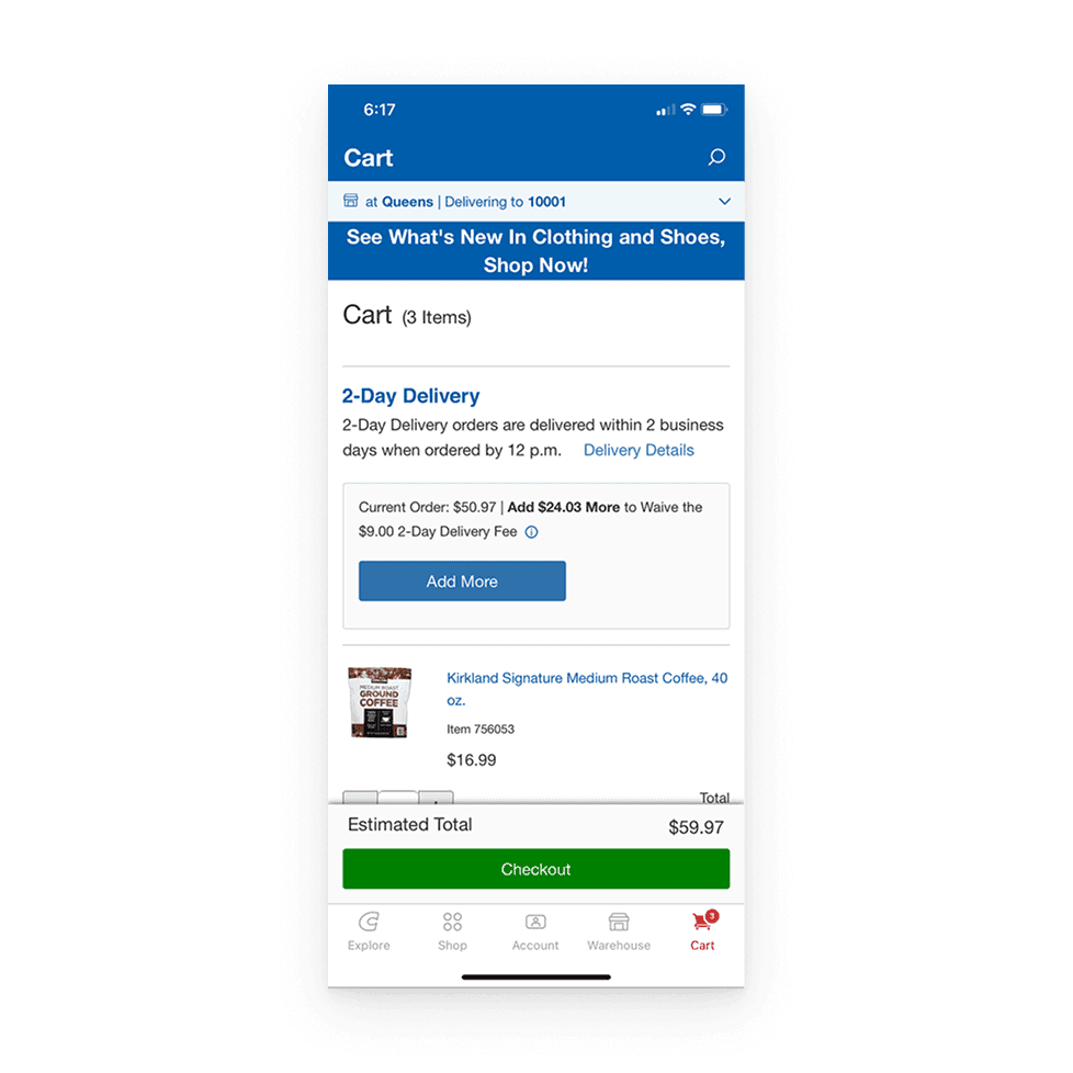
Cart screen layout: Delivery information is displayed before the actual product listings in the cart when the cart under a certain price limit. Users typically expect to see product information first in their cart. Shipping information doesn’t fit into the natural order of the shopping experience and can be confusing.
Severity: 🟠 Medium
Consistency and Standards
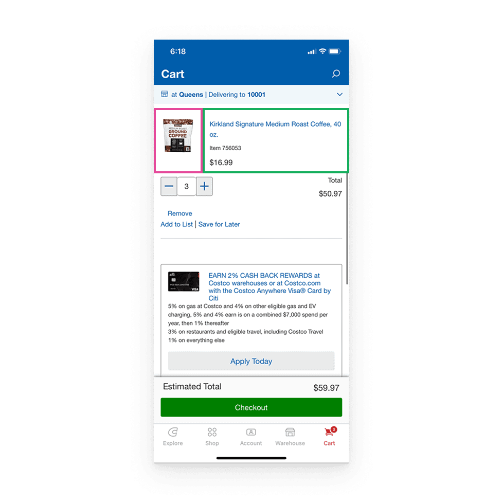
Cart interactions: Tapping the product image in the cart reopens the cart. Tapping the product description in the cart opens the product details page. When users click on a product image, they expect to be taken to the product detail page, but here the cart reopens, which does not fit common interaction patterns.
Severity: 🟠 Medium
Error Prevention
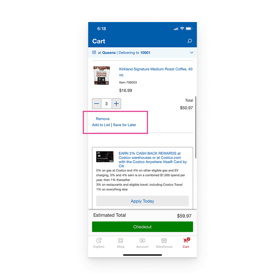
Cart actions: 'Remove,' 'add to list,' 'save for later' options are too small, potentially violating mobile accessibility standards. When touch targets are too small, users may accidentally press a different button or have difficulty selecting the button.
Severity: 🔴 High
Error Prevention
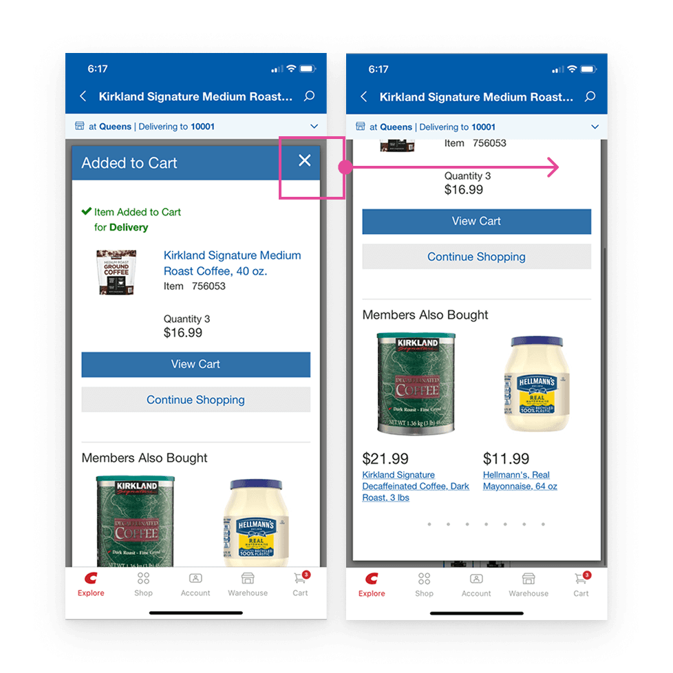
After tapping ‘Add to Cart,’ a scrollable pop-up appears with an “Added” message, however, scrolling hides the close button. This unexpected behavior may confuse users and lead them to think the action failed. Clear, static feedback with a persistent close option would reduce uncertainty and prevent missteps.
Severity: 🟠 Medium
Flexibility and Efficiency of Use
Cart actions like ‘Remove,’ ‘Add to List,’ and ‘Save for Later’ are too small, making them hard to tap on mobile. Small touch targets can lead to missed taps and frustrate users, especially those with motor impairments. Increasing button size would improve usability and accessibility.
Severity: 🔴 High
Aesthetic and Minimalist Design
Unnecessary information is displayed during the add to cart process. Highlighting the location information makes it difficult for the user to focus on the main action (add to cart).
Severity: 🟢 Low
Aesthetic and Minimalist Design
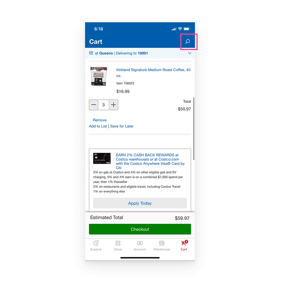
The search bar remains accessible on the sign-in/checkout screen. No obvious need. The user is presented with an unnecessary search bar during the payment or sign-in process. This can make the screen look crowded and cause distraction.
Severity: 🟢 Low
Help and Documentation
Checkout process strongly pushes for sign-in, without explanation. Users do not understand why they need to sign in and lack knowledge about this requirement.
Severity: 🟢 Low
Top 3 Recommendations

Visibility of System Status
Enhance "Add to Cart" button visibility (higher placement or sticky) to ensure users are always aware of available actions.

User Control and Freedom
Implement guest checkout to offer users more control and flexibility, allowing them to proceed without creating an account.

Error Prevention
Increase the size of action buttons ("Remove," "Add to List," "Save for Later") to prevent accidental taps and reduce user errors, especially on mobile.
Cognitive Walkthrough
User Goal: Find and purchase a desired item easily
Will users try to achieve the right result?
→Somewhat. Users coming to search for a specific product will take the correct action, because the search field is prominently visible. However, the placeholder text “Explore Costco” is not entirely intuitive. “Search for products” would better guide users toward their goal.
Will the user associate the correct action with their goal?
→Yes. When users tap “Add to Cart”, a success pop-up confirms the action and provides a direct link to the cart, making checkout easier. Additionally, the cart icon updates, reinforcing that the item has been added.
Will the user notice the correct action is available?
→ Partially. The search field and suggestions guide users well, but the “Add to Cart” button is below the fold, which may cause confusion as users might not realize they need to scroll.
Will the user know they’ve made progress after searching for and adding an item to their cart?
→ Mostly. The cart icon updates, and a confirmation pop-up appears, allowing users to view their cart. However, if the pop-up is scrollable and the close button disappears, users may struggle to exit or feel uncertain about the next step.
Opportunity: Enhance information hierarchy by making key actions like “Add to Cart” more visible and accessible, with clearer labels and visual cues.
Key Takeaways from Cognitive Walkthrough

Information Hierarchy:
The content organization on product screens and in the cart can be improved to better highlight key information like product details and prices, making it easier for users to navigate the app.

Accessibility and Usability:
The app has some accessibility concerns, such as small buttons for actions which could cause difficulty for users with impaired motor skills.

Learnability challenge:
New users may struggle with understanding the app’s structure and actions. Clearer labels and more intuitive instructions would help them navigate and interact more easily.
What I Took Away
Working with other UX designers and analyzing problems together was truly inspiring. Instead of saying “this part feels off,” we started saying “this goes against the error prevention principle” and that shift helped me approach design critiques in a much more professional way. I also realized how important it is to give clear, well-reasoned feedback and explain my ideas with confidence, especially when working in a team.
Thanks to the cognitive walkthrough, I’ve started to look at my designs not just in terms of how intuitive they feel, but also by how well they support users in completing specific tasks step by step. It’s helped me design with more empathy and purpose.
Thank you for exploring this project! I aimed to highlight a thoughtful, user-centered research approach throughout the process :)