Case Study
Building and Scaling a Design System for Pyde
Overview
Pyde is a start-up company that builds social platforms for niche areas, and it has 7 applications in stores. As our company grows, the reusability and consistency of designs have become increasingly important. We created a design system to meet this need, make our projects more consistent and optimize our design process.
My Role
I led the end-to-end project design, collaborating with a UX/UI designer and developers.
Timeline
Jan 2021 - May 2021
Tools
Figma
The Beginning of My Journey
In the beginning, we were using a massive Figma project for different product developments. However, this approach led to difficulties in ensuring consistency in colors and across products. We had to start from scratch with each new project. While this provided design freedom, as our product portfolio expanded and evolved, the need for both coding and visual consistency, along with reusability, became increasingly apparent.
Challenges:
To simplify things and foster a smoother working environment, we've made the decision to develop a design system.
Journey into the System’s World
While crafting our design system, I actually didn't have much experience in this area. So, my first step was to embark on a research journey. My focus was on thoroughly examining leading open-source companies in the industry. My goal was to create flexible and usable structures suitable for different platforms and products.
Firstly, I tackled the content architecture of the library. I made decisions to classify our existing projects, create a common design system, and establish a structure for the use of new components.
Throughout this process, I created separate files covering various components such as the iOS Design System, Android Design System, Style Guide, Icon Library, and Marketing. By crafting custom files for each of our applications, I managed to keep common components together while preserving our customized components.
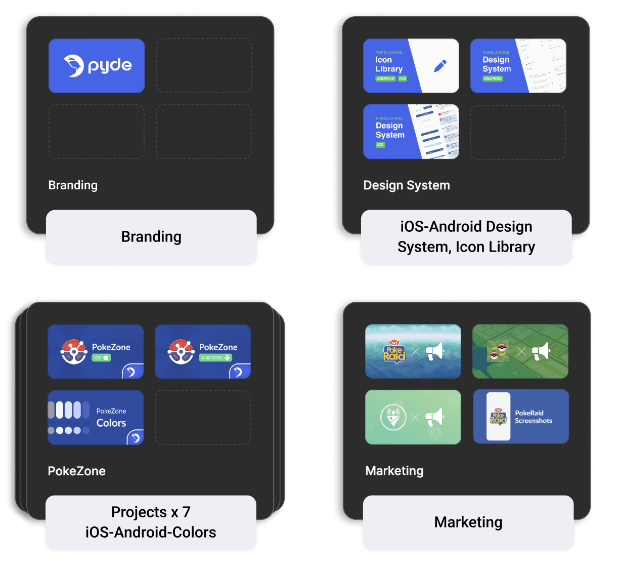
Grouped files in Figma
I also put together a comprehensive style guide, covering our project's customized components and brand guidelines. This guide helped ensure that both our design and development teams shared the same vision, fostering a consistent and unified experience.
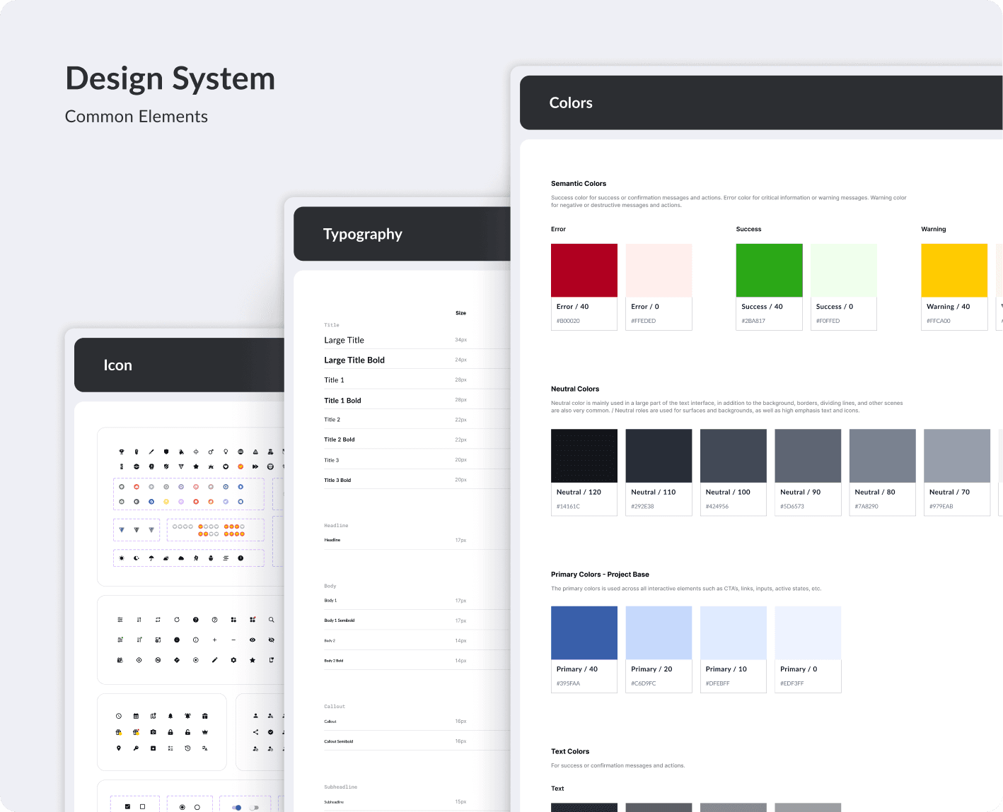
Common Elements
Carefully Crafting Every Detail
While constructing our library structure, I took care to ensure that the components were modular and scalable. This effort made them more usable across different projects and enabled us to establish an infrastructure that could adapt to future needs.
Components
I built our components atomically, starting from the smallest piece and gradually building up. When I started the project, Figma didn't have a variant system yet. However, with subsequent updates, I had the opportunity to align our component structures with the variant system. This new system made our work significantly easier, resulting in a more organized design. Therefore, the process of readjusting the structure was never difficult for us; in fact, it was quite enjoyable.
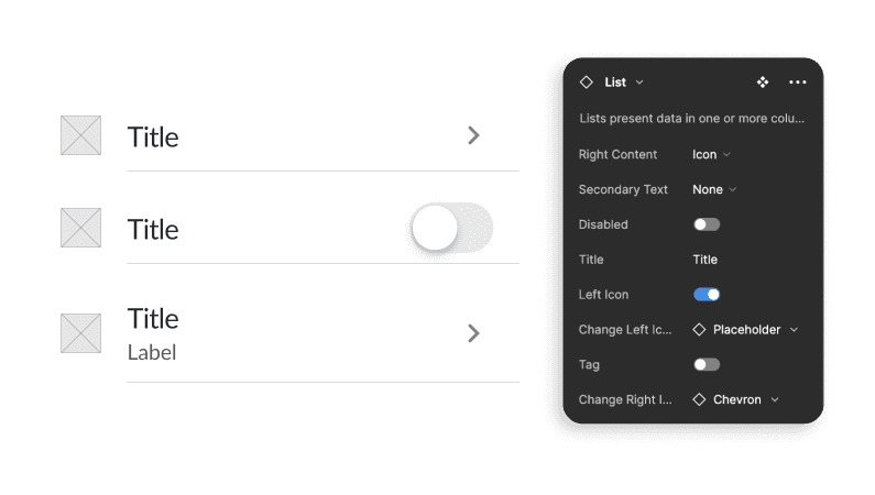
List component applied variant system
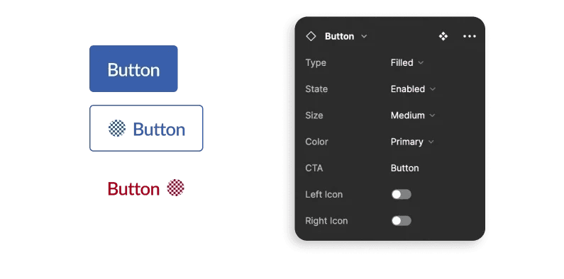
Button component applied variant system
Properties
When Figma introduced the Properties feature, it was a game-changer! Suddenly, I could create smarter, more compact, and more versatile components. Rather than creating multiple variants for each component, I could simply adjust the properties, expanding the utility of our components. It felt a bit like learning a new programming language, didn't it? We collaborated with developers, listened to their feedback, and together, we improved our production process even further. That's the power of teamwork!
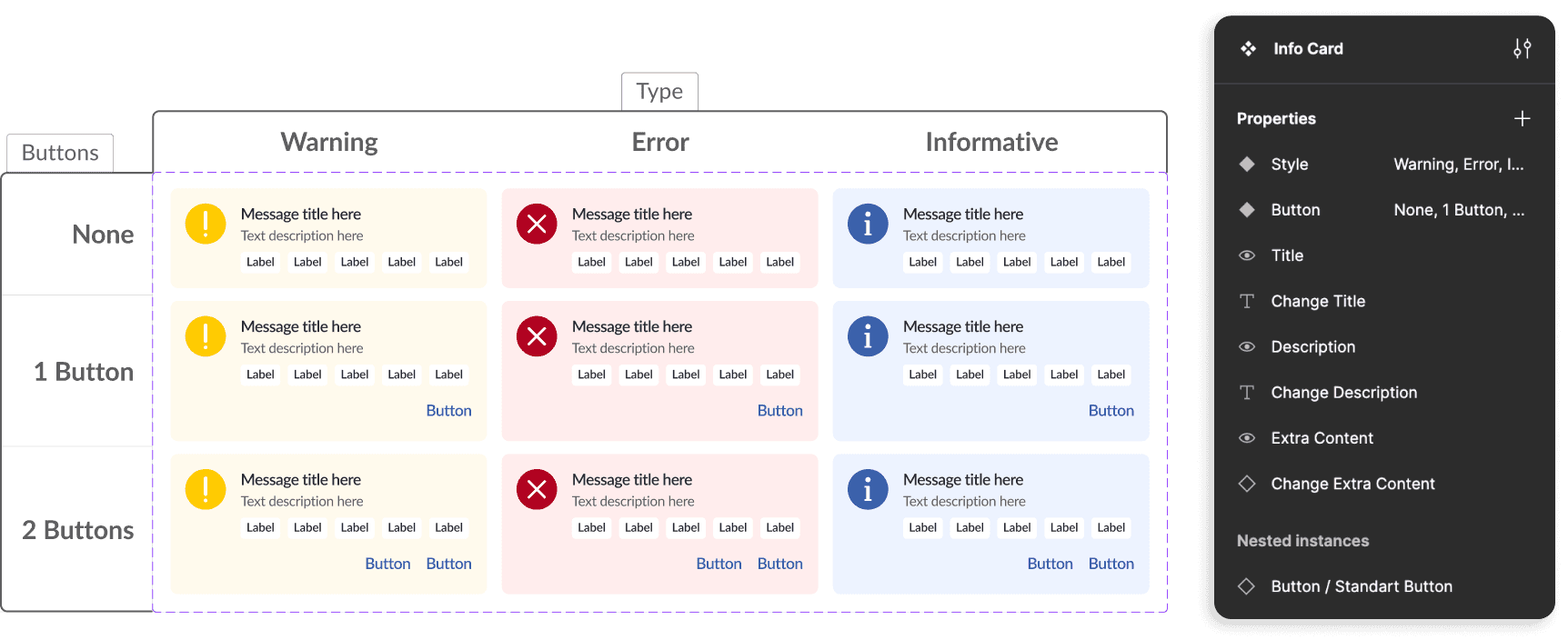
Properties of our information card
Auto Layout
Stepping into auto layout was initially a journey filled with trials, errors, and the constant search for solutions. However, as I persisted through those challenges, it evolved into a true passion for me. With every hurdle, I began to see the incredible convenience that auto layout brought us. In particular, in this project where we laid the foundation, auto layout became an essential part of our design process, and witnessing its contributions fills us with immense happiness and pride 💪.
Using auto layout on the screen created with components
The Hero's Journey
Building a design system is like giving your home a thorough cleaning; it might feel daunting and tiring at first, but the sense of order and freshness you achieve in the end makes it truly rewarding. Along the journey, we face challenges and obstacles, but we overcome them with perseverance and faith. Ultimately, the feeling of success washes away all the hardships, leaving us filled with pride and satisfaction 🙂.
🙌 The Victory
💪 Encountering Challenges

Components
Rebirth and Looking towards the Future
Continue to design better experiences
We now have a solid design system in place that we can continue to refine and expand upon. It will continue to evolve over time. With new designers joining our team and the creation of new components, we look forward to further enriching this library.